CELEMI branding & packaging
Task & Challenge
CELEMI is an innovative skincare brand with completely fresh approach to a skin routine. The main focus is on disciplined beauty routines to achieve exceptional results. Our task was to create a brand name, branding and packaging system matching this approach.
In an era where the abundance of beauty products can be overwhelming, a systematic path is necessary to provide clarity and structure to skincare users. According to Justė Pinkevičienė, the owner of the CELEMI brand, all skincare products are worthless, unless used in a disciplined way. Our created brand had to stand out among the competitors creating a distinct and recognisable brand look & feel.


Solutions
First of all, we started our project with a brand name. [C’est la mi]: That's me. CELEMI brand name is an adaptation of the well-known French phrase "c'est la vie" (that's life) with a playful twist of replacing "vie" with “me." CELEMI believes that consistent beauty routine is a must for great skincare results.
We created a brand identity & packaging system that brings the feeling of clarity, structure, and power to skincare users. A set of distinctive features of visual identity together make a powerful and structured style:
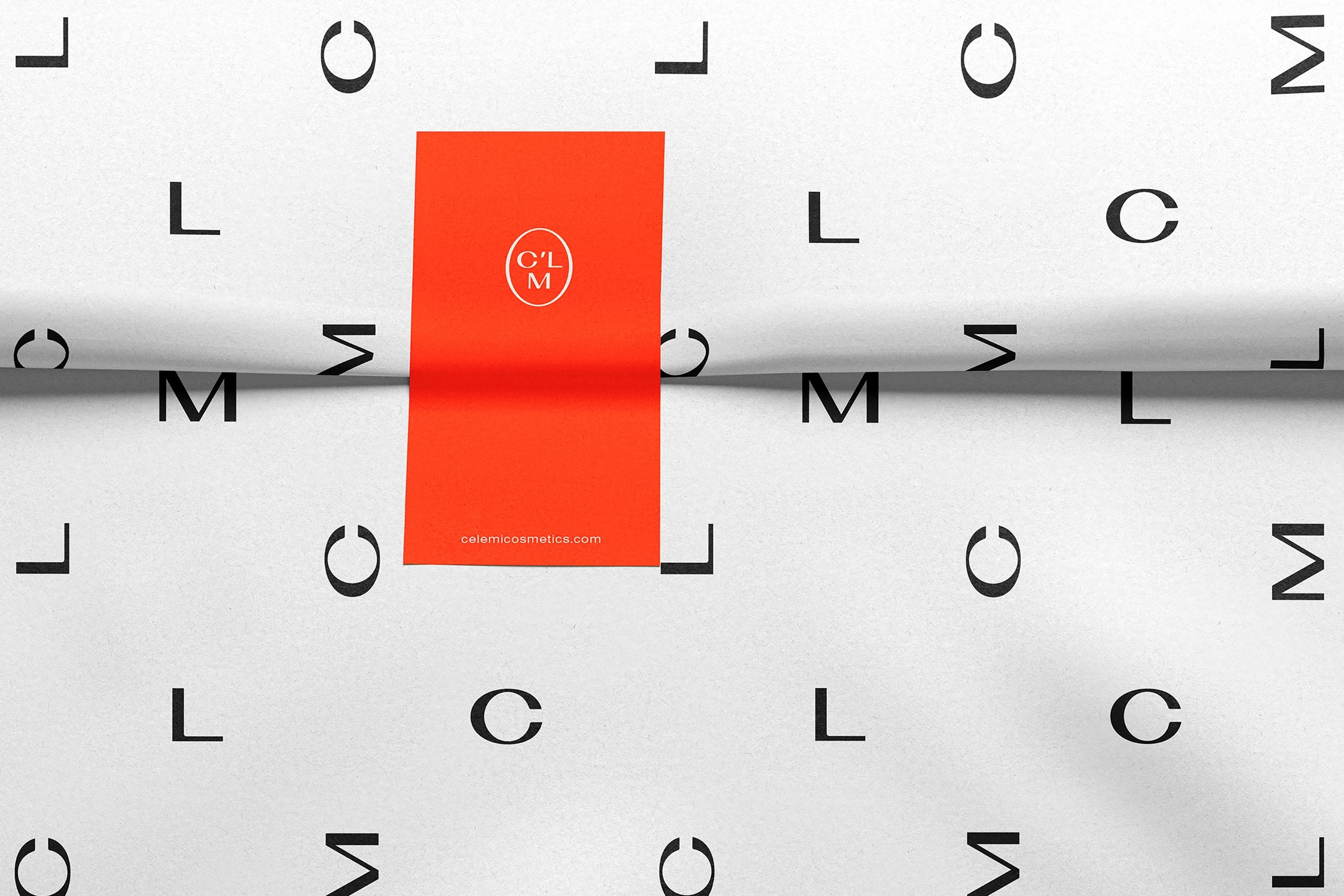
• A custom and exclusive word-mark with extra wide capital letters creates a trustworthy, self-confident mood. Rounded corners add a touch of softness and approachability.
• A specially created symbol that is used separately from the wordmark logo. This emblem, composed of the main brand letters, adds a touch of sophistication and elegance to the brand.
• It consists of the main brand letters, this way accentuating the high quality products the brand offers.
• A distinct pattern used all over the different products to shape a unified and premium look & feel.
• A vibrant bright red-orange colour is used as an accent, a touch of energy, and confidence.
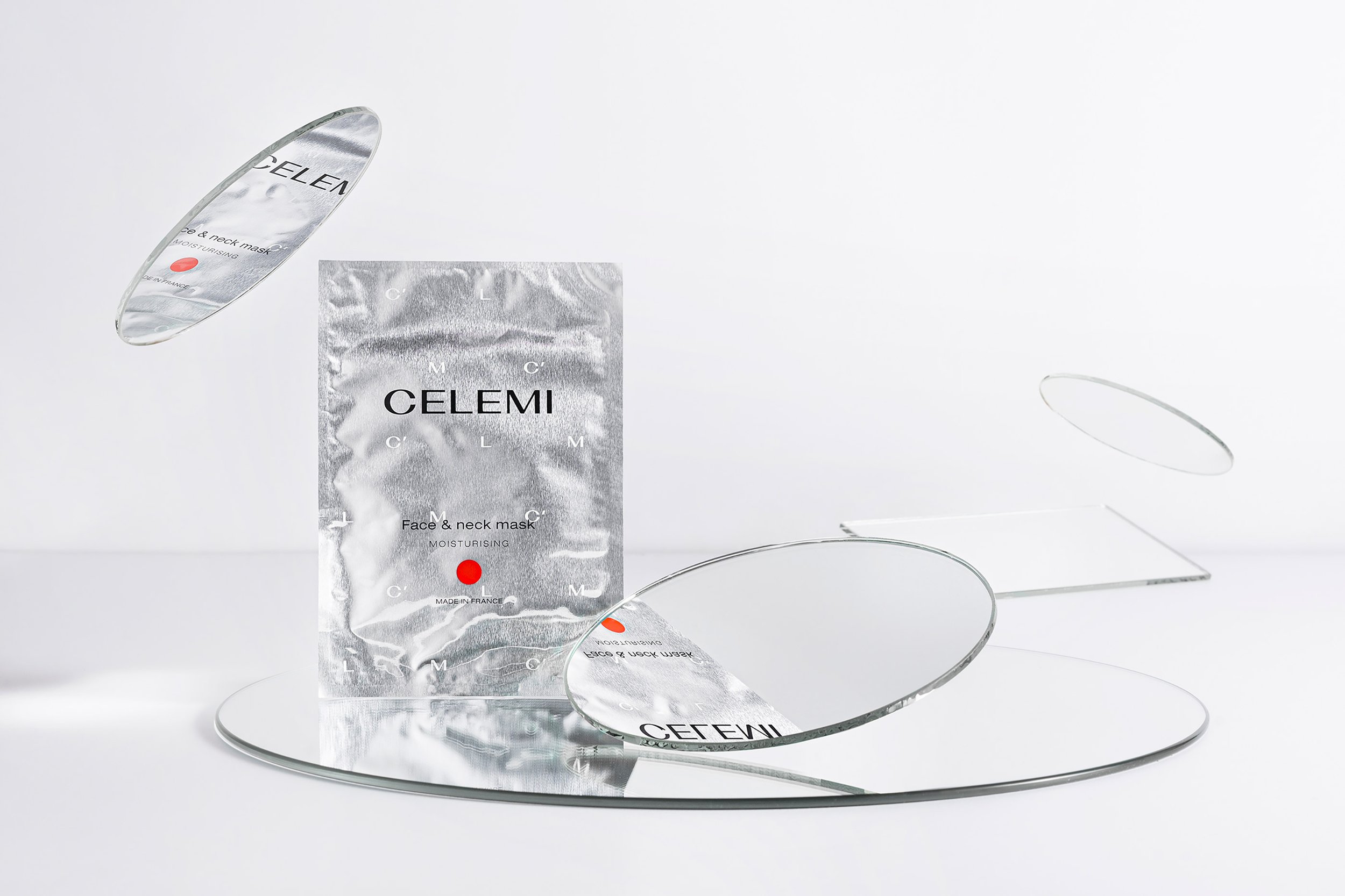
• A mirror serves as a powerful reminder of the brand's core values: accepting oneself and feeling confident in one's own body. Therefore the mirror is featured in photography, while its silver colour and texture are integrated into packaging and brand identity.
• Packaging is simple, yet powerful, leaving only the essential information. A red-orange colour dot unites the design system, also emphasising the disciplined routine to have a healthy skin.
• Inclusive model photography: models showcase good skin condition, which is achievable by effective skincare routines, while embracing the natural imperfections of the skin, such as small wrinkles, freckles, and blemishes. Moreover, all the models have a “no filter” look - only the skincare by CELEMI.
Research
Brand Strategy
Tone of voice
Visual Identity
Creative Direction
Logotype
Branding
Merchandise
Prototype
Packaging
Packaging system
Label
What’s Golden?
To keep the disciplined routine and make the skincare products work, you need to organize your every day life. That is why we created a notebook that includes weekly beauty planner, monthly roundups and advice from medical doctor to dieticians.
Credits
Head of product development: Justė Pinkevičienė,
Agency: Great & Golden
Strategy: Toma Stasiukaitytė
Art direction & design: Gabija Platūkytė-Azarevičė, Julija Stasiulaitė
Project Manager: Lilė Adomaitė, Daumantas Kairys
Photoshoot: Packshot Studio
Great&Golden © 2023