TRIDENS Rebrand
Task & Challenge
Tridens is a highly experienced distributor providing professional marketing, sales and distribution services of alcoholic and non-alcoholic beverages, tobacco, food and consumer goods in the Baltics since 1988. The existing visual identity, which had been in use for a few decades, was outdated and required an update.


Solutions
We updated the logo and created a new visual identity, aiming to achieve a balance between the company's heritage and innovative concepts. Our primary keywords were distribution, historical background, trustworthy partnership, sophisticated & timeless design.
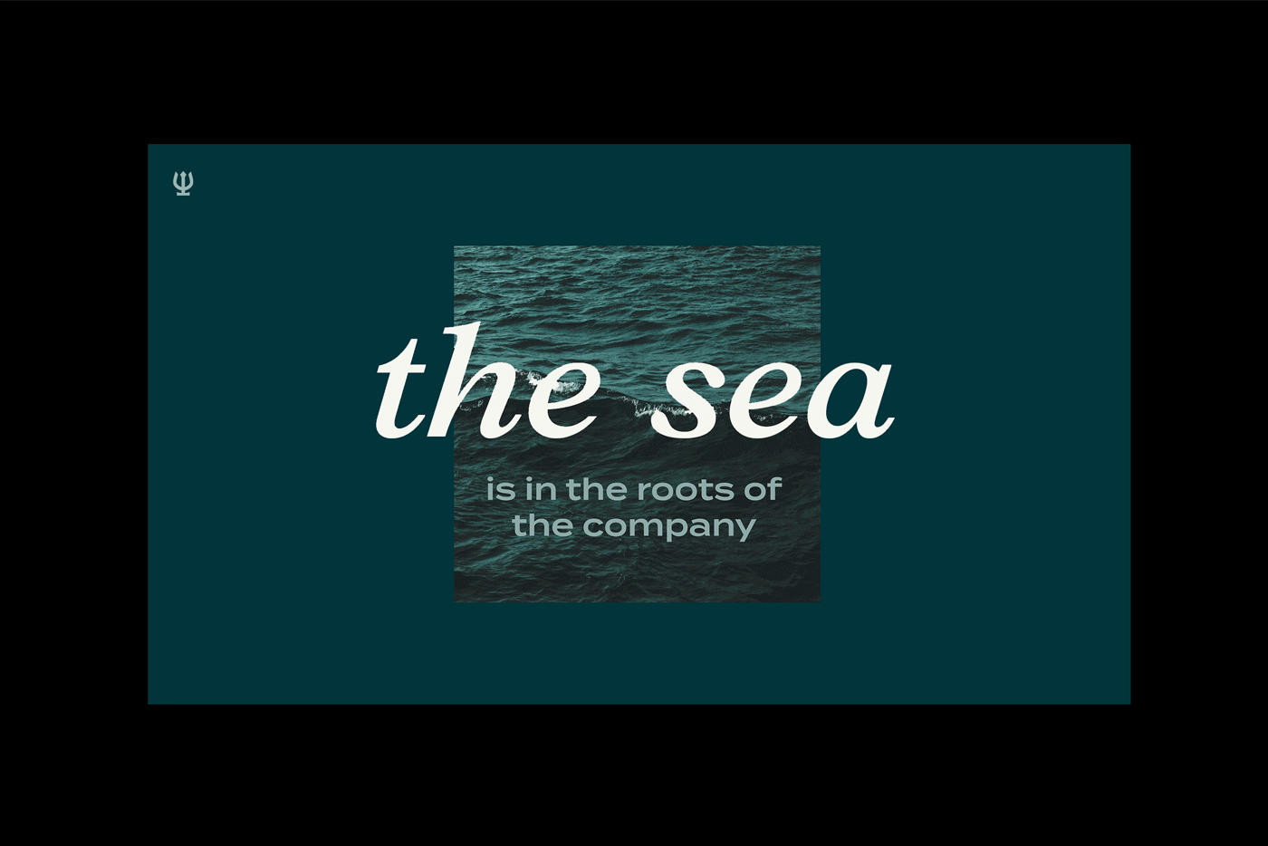
To have a modern brand's visual identity, we simplified the trident symbol with a glass in the logo. Then we paired it with contemporary yet timeless typography. A defining feature of Tridens' visual identity is an embodiment of a sea concept, which has a strong historical meaning for the company. We have intentionally integrated this concept into every aspect of the identity: the logo, letterforms, colour scheme, patterns and imagery.
Research
Brand Strategy
Tone of voice
Visual Identity
Creative Direction
Logotype
Branding
What’s Golden?
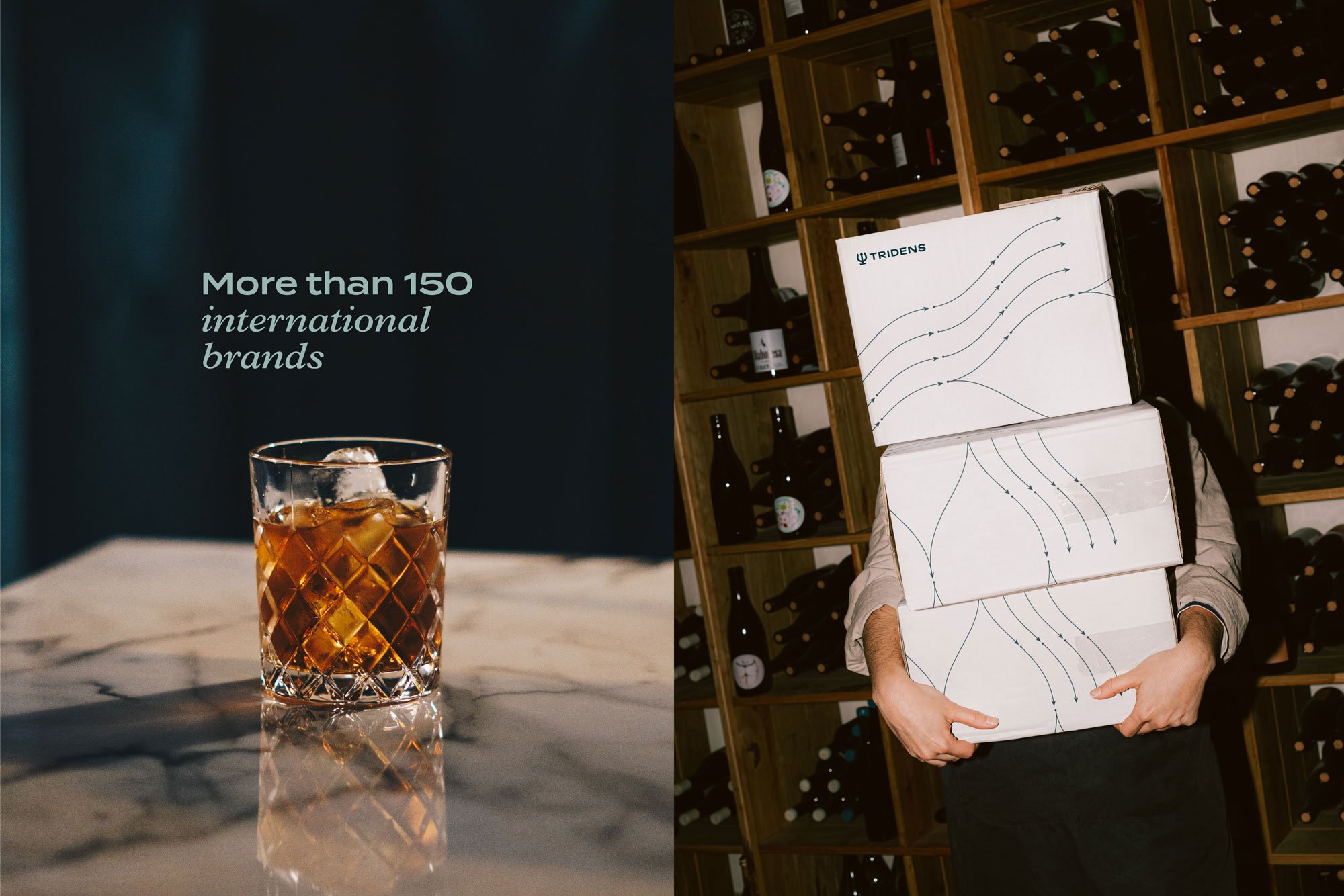
We developed a dynamic pattern that resembles sea currents and recreates the concept of distribution. It is intended to visually represent the process of distributing goods, a widespread and efficient delivery. The pattern is made from arrows, which go in diverse directions, just like sea currents. They expand and contract, forming unique and endless compositions. It is a versatile and adaptable visual element that adds depth and significance to the overall visual identity of Tridens.
Credits
Strategic insights: Toma Stasiukaitytė
Art Direction & Graphic Design: Julija Stasiulaitė, Gabija Platūkytė-Azarevičė
Motion design: Laura Jagėlaitė
Project manager: Lilė Adomaitė
Great&Golden © 2022