Zveryno lapes branding & visual identity
Task & Challenge
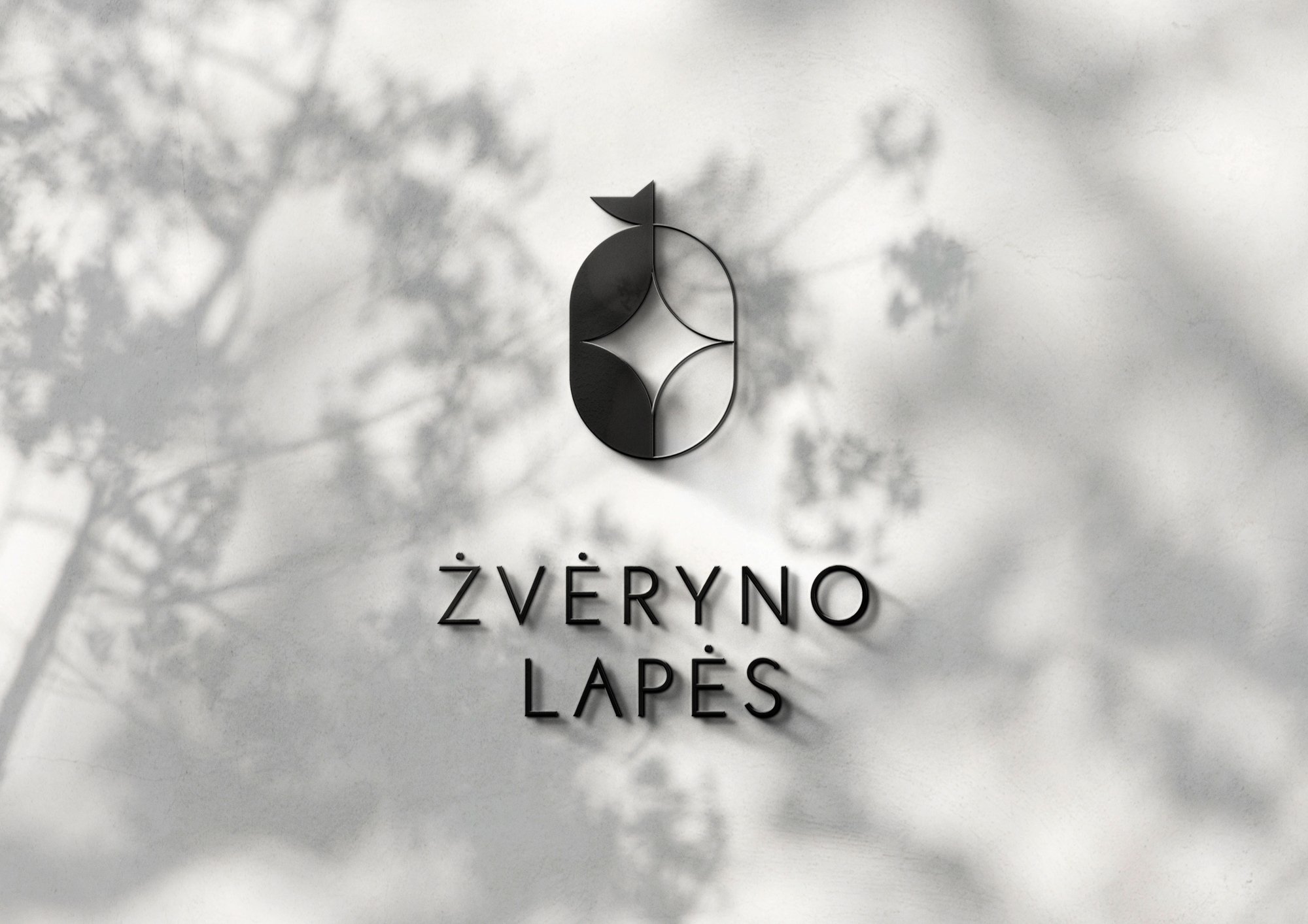
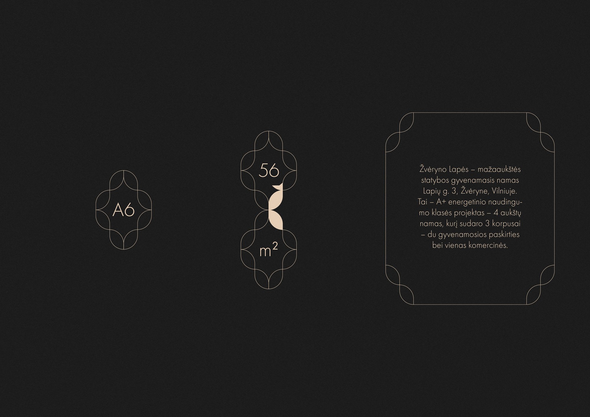
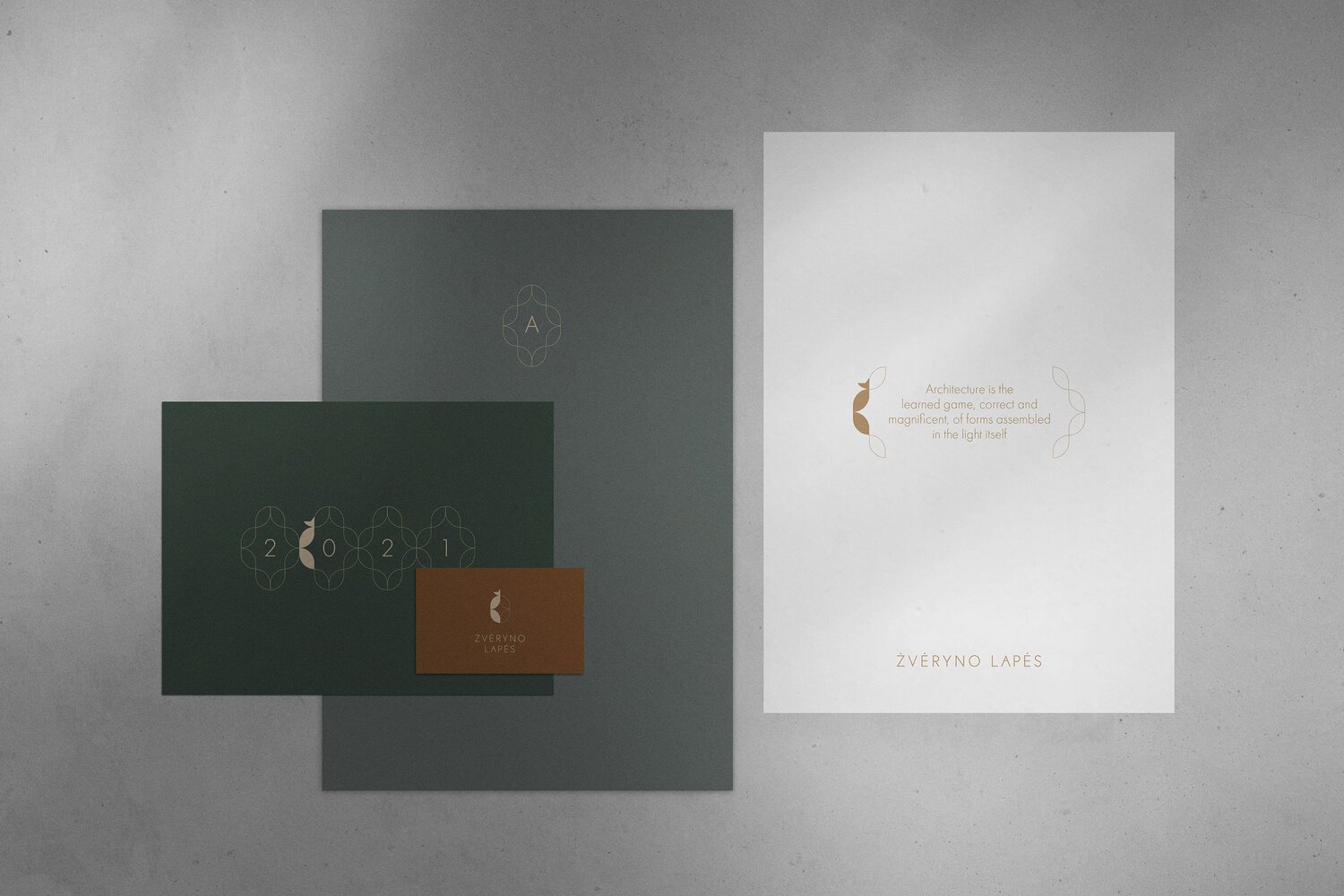
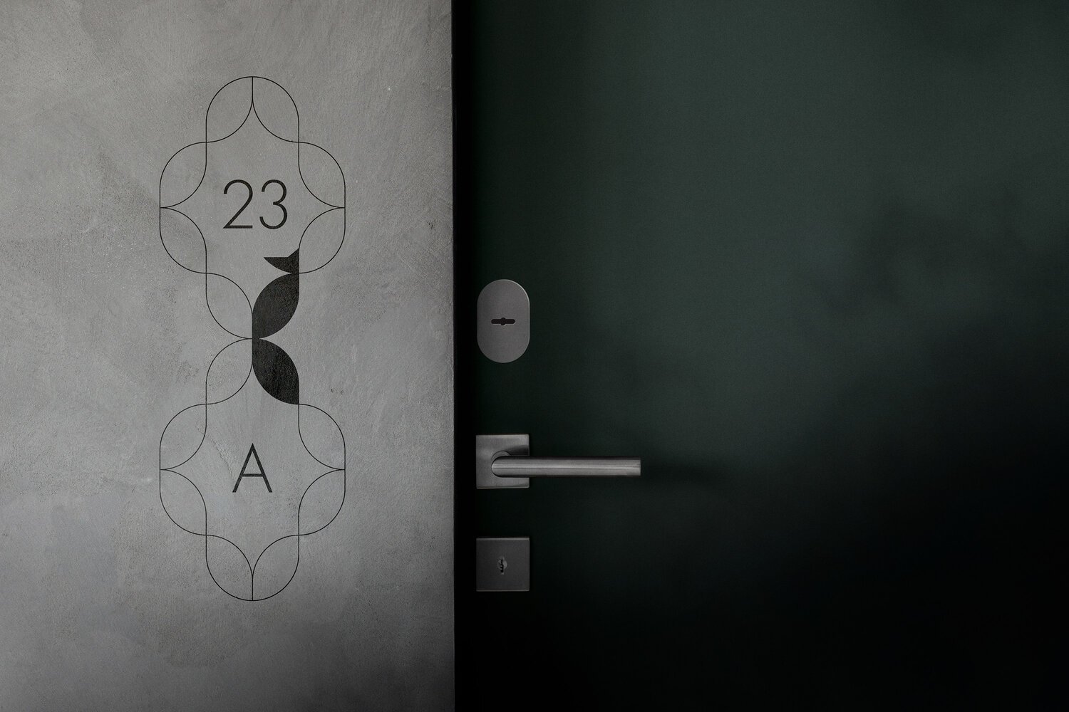
“Žvėryno Lapės” (Lapės meaning Foxes) is a premium residential complex located in one of the greenest areas in Vilnius. Our goal was to create a brand identity with a logo that could easily blend into being a flexible visual identity across different brand touch points.
SOLUTIONS
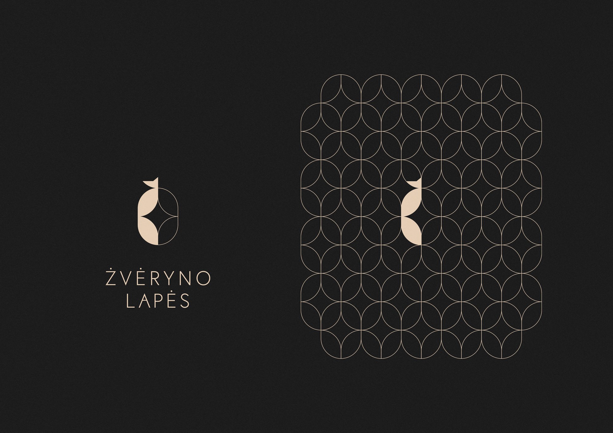
The fox symbol became the main silhouette for the identity. It represents the natural side of the residential buildings, being surrounded by nature. It also gives a feeling of reflecting the dynamics of the city: always changing and developing, yet having a calming side to it.
Logotype
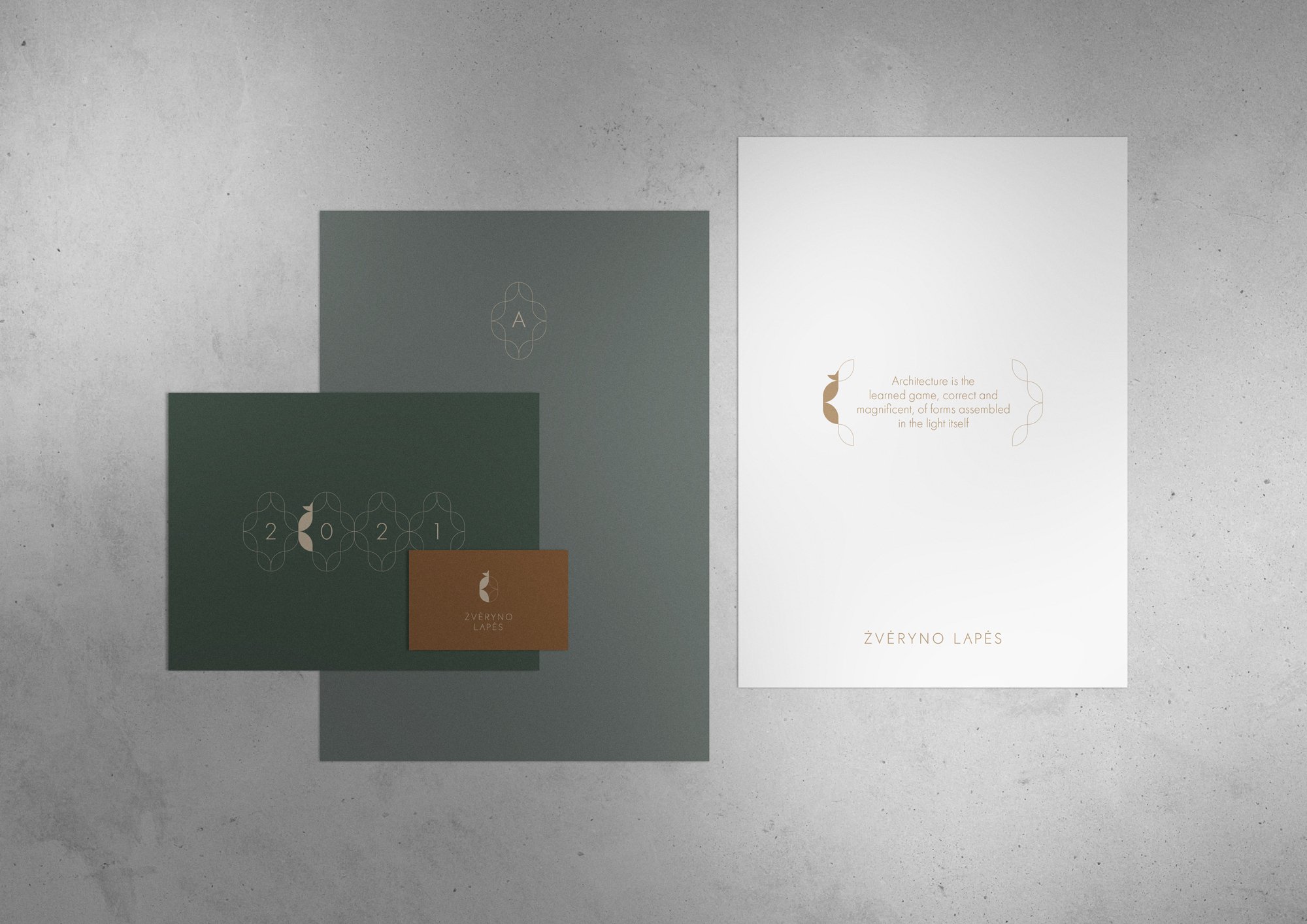
Branding
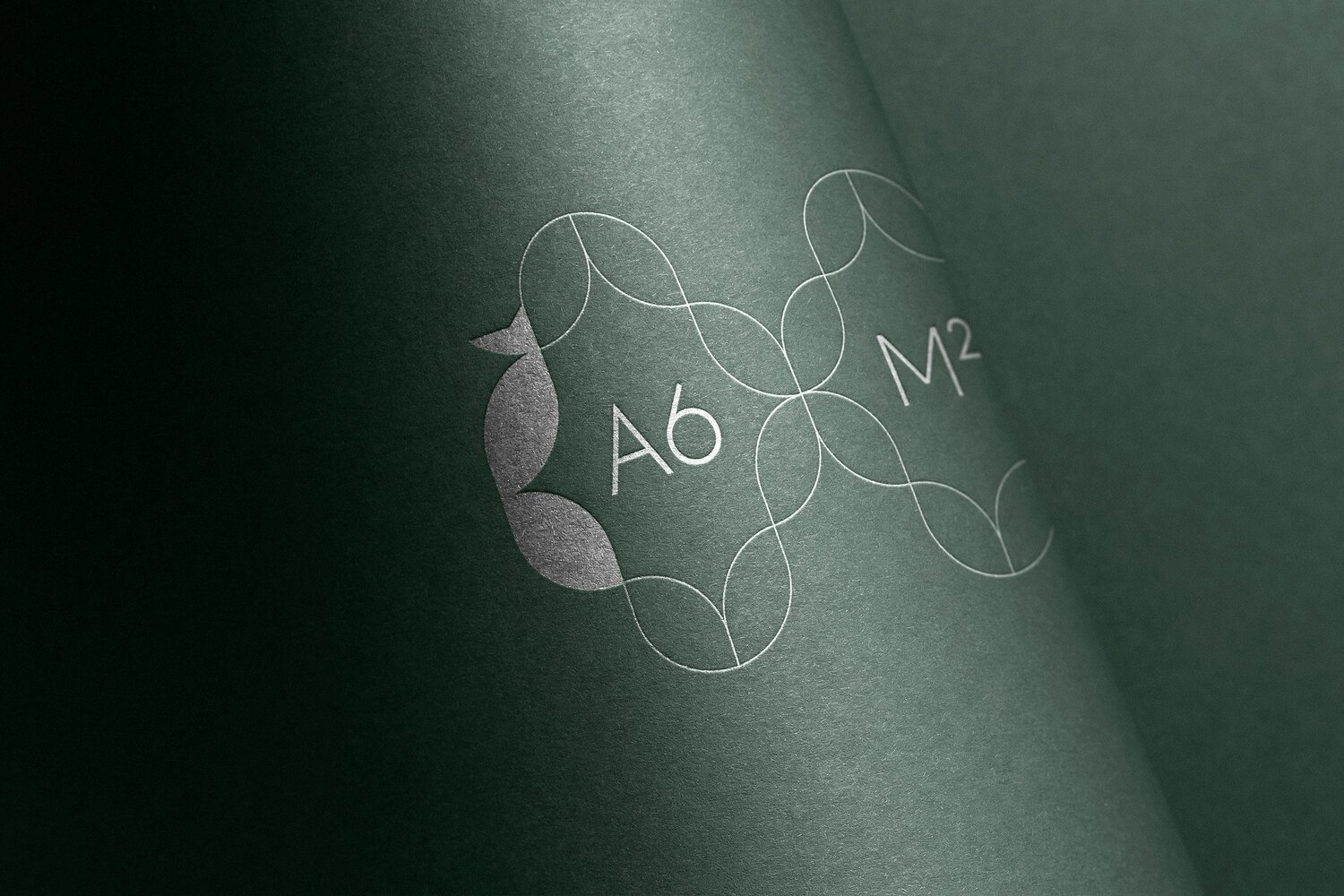
Visual identity
Real estate Identity
What’s Golden?
We created a distinct little fox symbol that becomes can easily turn into pattern and give a unified look & feel for all the project.
Credits
Art direction and graphic design: Aidas Šumskas
Project Manager: Daumantas Kairys