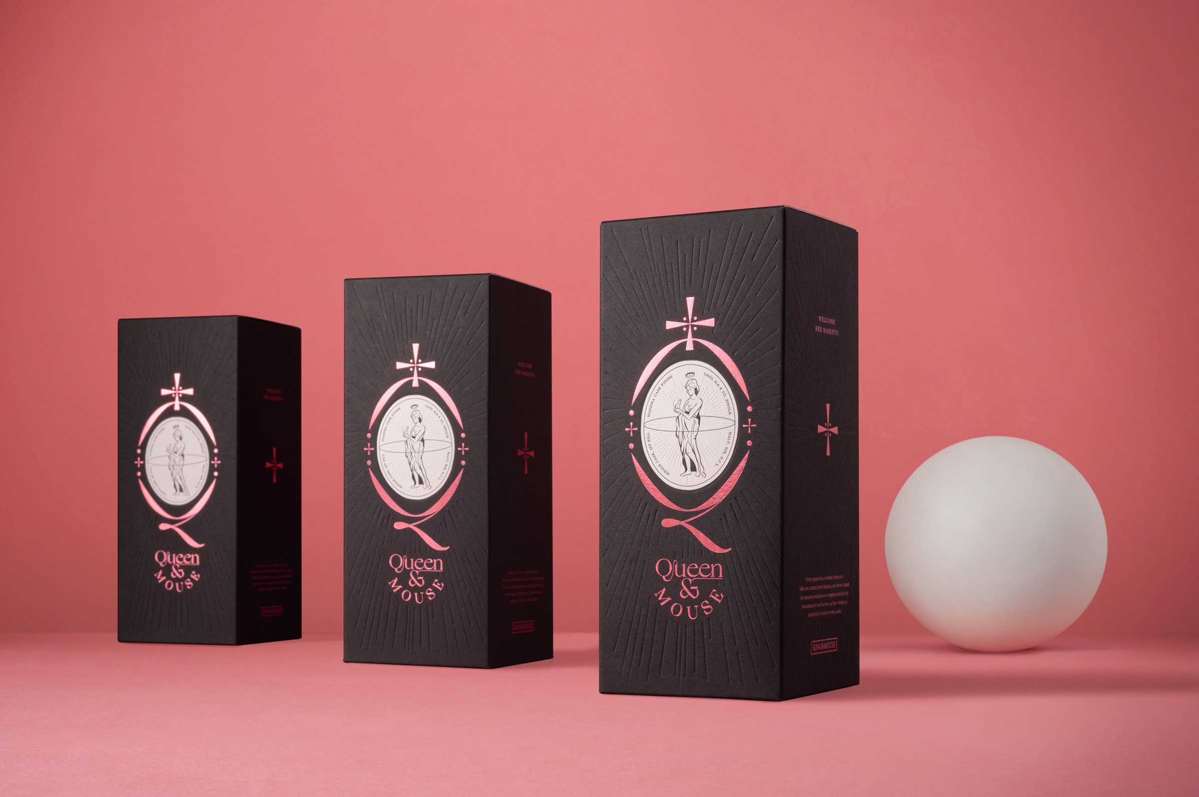
Queen & Mouse whisky
Task & Challenge
King&Mouse is one of the most popular whisky bars in Lithuania, not only selling whisky, but also creating their own blends. This year they launched Madeira cask-finished whisky which is called pink by whisky professionals. It has a smooth taste and was made of ingredients found in Madeira island of Portugal. We had to create a name and packaging for this special product.
As King&Mouse has more than 300 whiskies in their store, the one they make themselves has to look exclusive and be outstanding in this worldwide assortment of such a historic liquor. As this whisky was going to be made in a small batch of a few hundred bottles, we had an opportunity and a commitment to creating a crafty solution for the packaging.


Solutions
We decided to create whisky as a statement piece. We wanted to show, that the world of whisky is open for everyone and it already moved on from its masculine and highly conservative image. We selected the colour pink as an antidote to the usual whisky label design and to emphasise the origin of the product. Moreover, we wanted to represent the femininity of it and used dark colours to make it pop out, moreover - to stay in line with the bar branding.
Research
Creative Direction
Logotype
Prototype
Packaging
Label
Whisky packaging
What’s Golden?
We were crafty with the details and selected special solutions. Pink foil on the black box is used to make it stand out amongst other boxes in the store. Also, we embossed some details on the label and the box – it gives the uniqueness and premium touch to it, moreover - you can get the sense of tactility.
Credits
Client: King&Mouse
Design: Gabija Platukytė, Liudas Barkauskas, Aidas Šumskas
Project Manager: Daumantas Kairys
Photoshoot: Studio Packshot
Great&Golden © 2021
