Budvytis & Partners branding
Task & Challenge
"Būdvytis ir partneriai" is a law firm providing legal advice on all aspects of business law to both local and international clients.
The challenge was to capture the essence of the brand, which is centered on discovering solutions that go beyond conventional boundaries and commitment to overcome challenges despite the odds.


Solutions
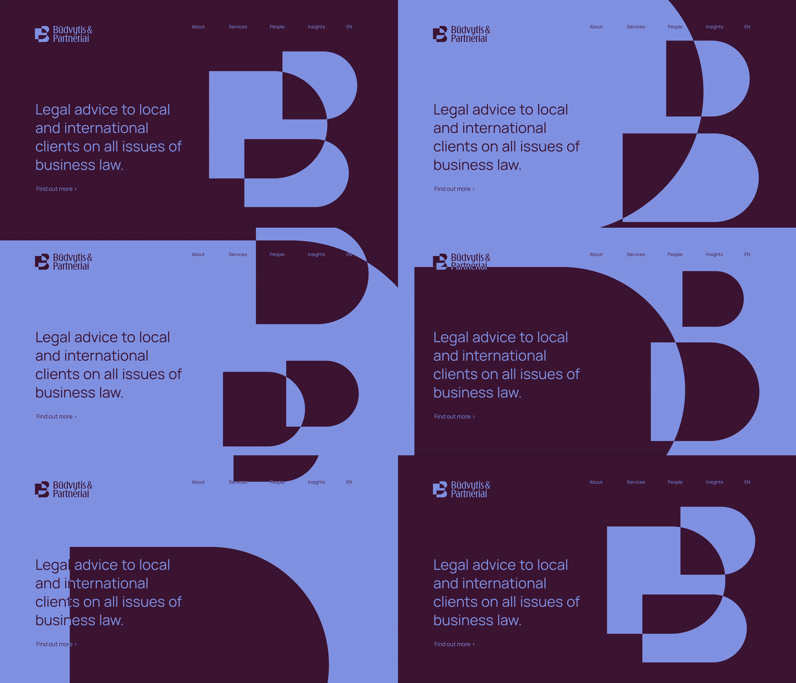
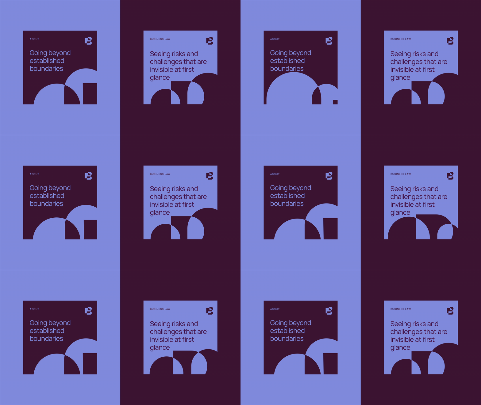
The core of the brand is embodied in the phrase "against all odds," which highlights the company's dedication to finding solutions that go beyond traditional boundaries. To capture the brand's essence, we incorporated it into the logo symbol, which also serves as a dynamic graphic element. The symbol, which is similar to a monogram, consists of three intersecting components that resemble the letters B and P.
When the elements intersect, new shapes emerge, representing the relentless pursuit of the best solution and the ability to consider situations from a broader perspective, even if it means challenging established limits. Additionally, this intersection signifies the search for and identification of unnoticed factors, such as managing risks and overcoming challenges. The branding features a distinct color palette that is both sophisticated and bold, making it stand out from the crowd.
Brand strategy
Research
Tone of voice
Creative Direction
Logotype
Branding
Visual Identity
Stationery
What’s Golden?
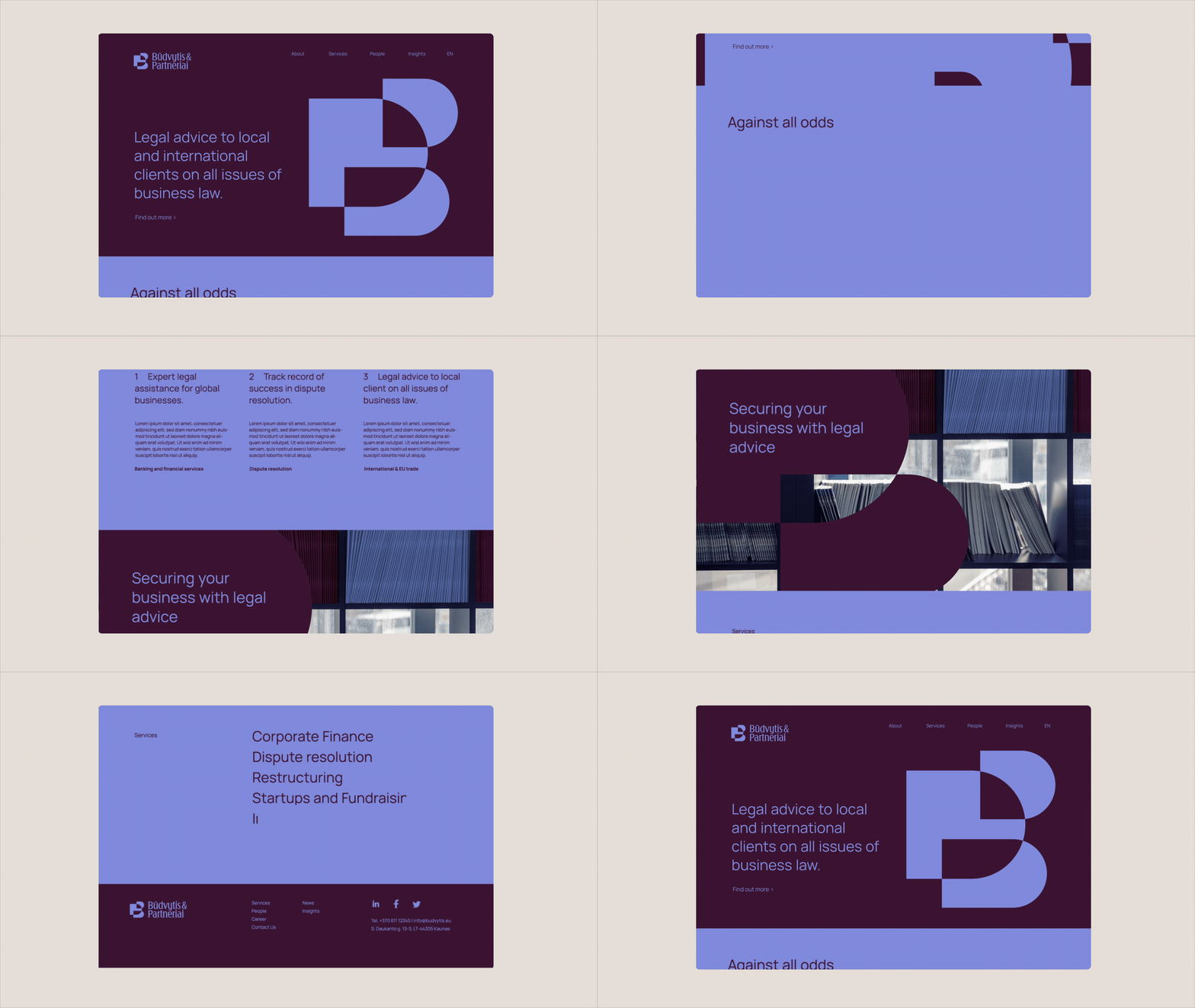
A bold and sophisticated visual identity was developed with the brand essence seamlessly integrated into the brand symbol.
Credits
Client: Būdvytis & Partneriai
Agency: Great & Golden
Strategy: Toma Stasiukaitytė
Art direction & design: Julija Stasiulaitė, Gabija Platūkytė-Azarevičė
Project Manager: Eglė Paliulienė
Great&Golden © 2022
