Urban Hub branding & visual identity
Task & Challenge
Urban Hub is a stock office complex, unique because it offers storage, commercial and office spaces in one place. Moreover, it is strategically placed in convenient locations, with broad infrastructure for successful business development and expansion.
The stock office segment is gaining significance in an industrial real estate market. Many players are entering the market, therefore building a distinctive and long-lasting branding is essential.


SOLUTIONS
The brand name is Urban Hub, but the logo puts the focus on the word HUB to convey the main message – it is a hub, a central place where business get accelerated.
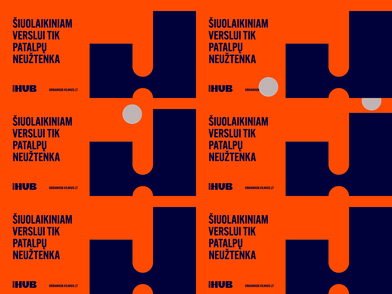
We created an identity capturing the ambitious, energetic character of the brand. The concept is based on the idea that Urban HUB is a place to jump-start your business if you are based here. Animation of a bouncing ball, jumping and taking a leap forward is used to express this idea.
Bright, vibrant colours, bold typography and a system of flexible layouts create an identity system that has ambition and growth at its core.
Brand Strategy
Tone of voice
Creative Direction
Logotype
Branding
Visual Identity
Merchandise
What’s Golden?
Vibrant identity with a bouncing animation encourages to take a leap and jump-start your business.
Credits
Client: Urban Hub
Strategy: Toma Stasiukaitytė
Art Direction & Graphic Design: Gabija Platūkytė-Azarevičė, Julija Stasiulaitė
Project manager: Lina Petrauskaitė
Great&Golden © 2022
