BAJORU Premium Vodka packaging
Task & Challenge
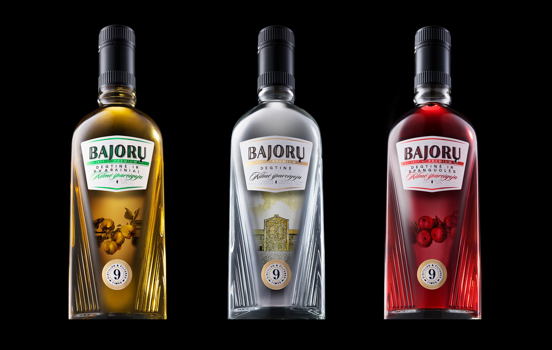
BAJORU Premium Vodka is a distinguished brand crafted in the renowned Lithuanian distillery in Obeliai. Our challenge was to elevate its identity—enhancing its visual appeal while preserving its loyal consumer base. This required a complete transformation: refining the logo, reimagining the label, and designing an entirely new bottle from the ground up.


Solutions
We began by rethinking the bottle’s structure, introducing angular contours that create a striking, shelf-worthy presence. The redesigned label features a bold new logo, ensuring strong brand visibility and a refined aesthetic. To enhance the premium feel, we employed a double foiling printing technique for optimal coverage and intricate detailing. Elegant embossing and debossing add depth and sophistication, while the label itself—crafted from pure white stone-mass paper with micro-texturing—embodies the purity of the vodka. Designed for durability, it maintains its pristine appearance even when chilled in ice.
Research
Creative Direction
Logotype
Branding
Merchandise
Prototype
Packaging
Packaging system
Label
What’s Golden?
The fusion of these refined elements results in more than just packaging—it delivers a true premium experience. Every detail, from the structural form to the tactile finish, harmonizes luxury with resilience, reinforcing BAJORU Premium Vodka’s position as a top-tier brand.
Credits
Art Direction & Graphic Design: Gabija Platūkytė-Azarevičė, Ugnė Akstinaitė
Project manager: Lilė Adomaitė
Photoshoot: Packshot Studio
Great&Golden © 2024