USTUKIU packaging
Task & Challenge
USTUKIŲ is a family owned company established in 1992. For over 30 years, they have been making high quality, organic and natural rice, wheat, spelt, corn, buckwheat and other cereal cakes and crisps. Our task was to create a new packaging system, distinguishing the brand on the shelf, making it recognisable and show the historical value. USTUKIŲ had diverse product range with different product names, it was difficult for customers to recognise and associate them with a single brand. They needed a unified brand name and distinctive packaging to bring everything together and make it stand out on shelves.
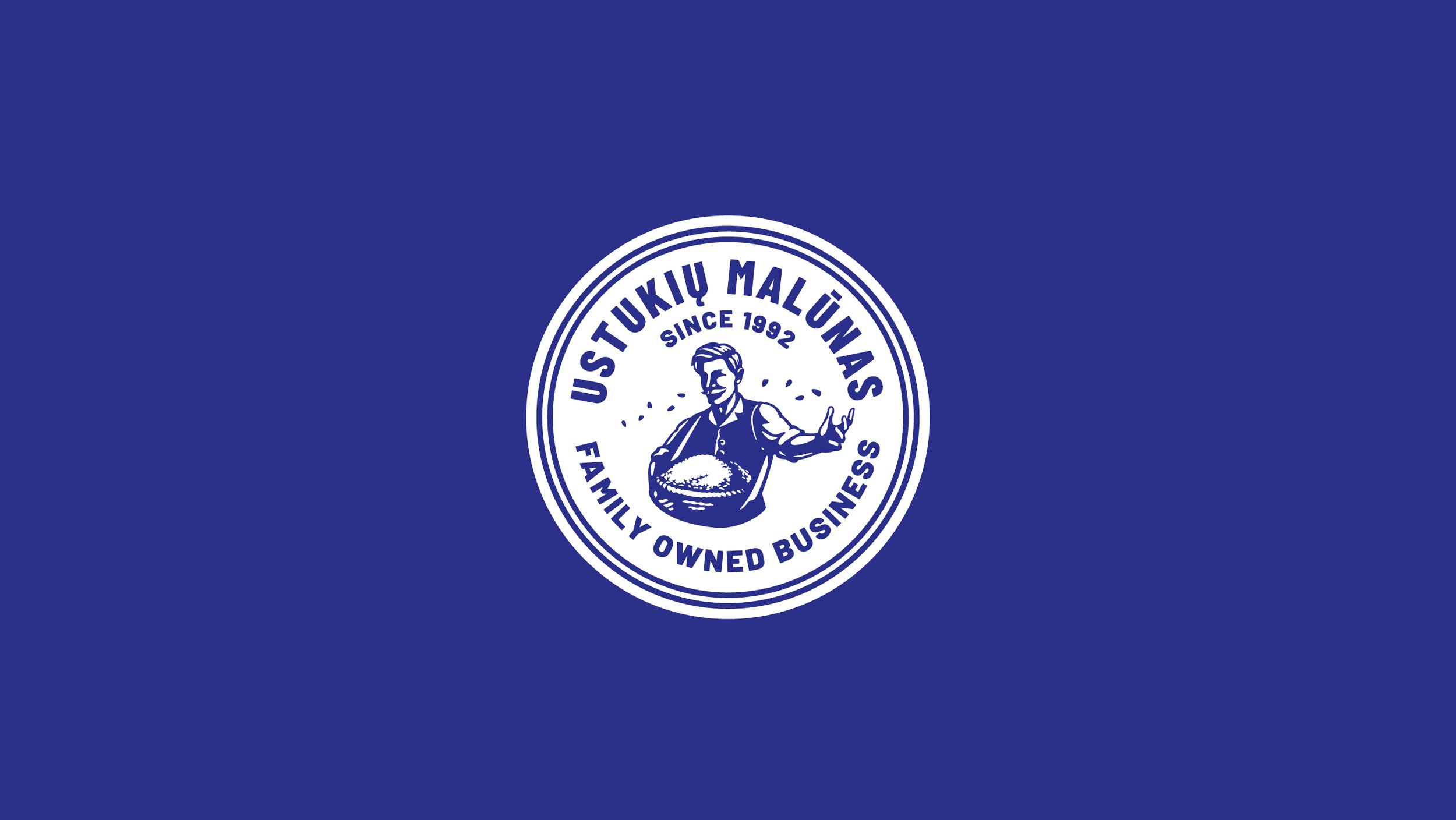
The brand name boldly stands out with an amplified logo, ensuring better visibility and instant recognition. The original emblem of an elderly man carrying grains, symbolizing tradition and our longstanding history, was retained and refined.


Solutions
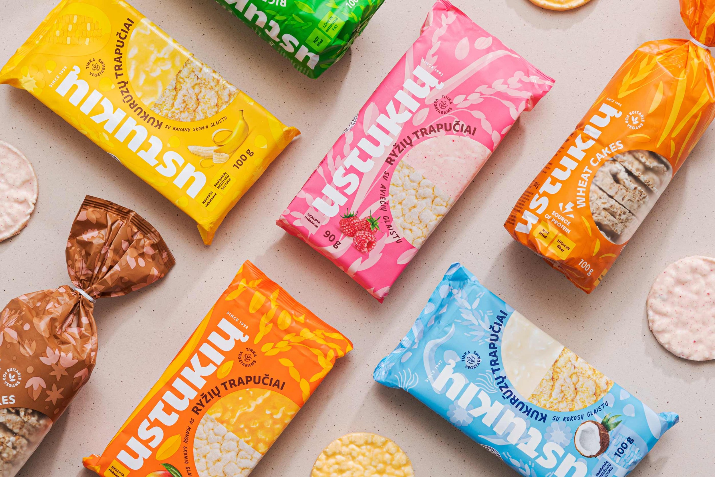
We introduced a new packaging system for the diverse range of cereal crisps, all under the unified brand name USTUKIŲ. The brand name boldly stands out with an amplified logo, ensuring better visibility and instant recognition.
To maintain the brand's authenticity, we retained the original emblem of an elderly man carrying grains, symbolising tradition and our longstanding history. This refined emblem is now presented as a stamp, featuring the establishment date and emphasising family-owned status.
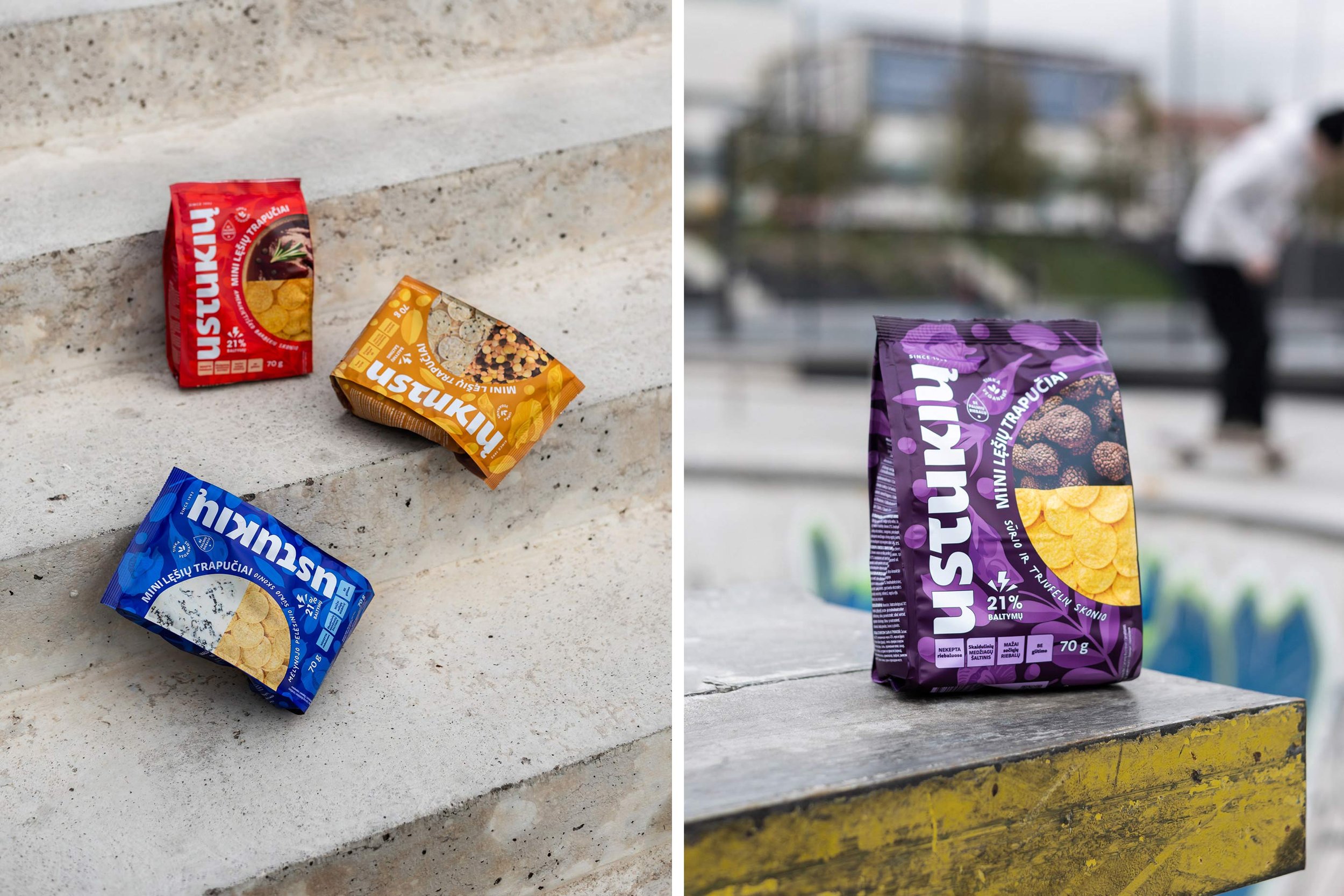
Unique illustrative patterns were developed for each product, highlighting its main ingredient for quick identification. For example, if the crisps are made out of buckwheat, we see the pattern containing buckwheat. The pattern is subtle, not attracting too much of attention, though making the design thought through.
Each packaging showcases a photo circle. It is divided into two halves, to display the product (top part) and to indicate its taste or cereal type (down part). These circles can connect even on busy shelves, creating an appealing visual display, making the packaging have both “good faces”.
We introduced a new colour scheme with vibrant colours corresponding to each product's taste. Friendly and legible fonts were carefully selected to enhance readability on the packaging. To make the design stand out, we also emphasised the details - logo, picture, some texts and claims by using soft touch and glossy varnish.
Finally, informative claims were added to communicate the benefits of the products to customers, enriching their understanding and appeal.
Research
Brand Strategy
Tone of voice
Visual Identity
Creative Direction
Logotype
Branding
Merchandise
Prototype
Packaging
Packaging system
Label
What’s Golden?
USTUKIŲ packaging design now unifies all products under a single brand, ensuring visibility and recognition on shelves. What is more, now you can easily identify the brand name and quickly find out the flavour and it’s main health benefits.
Credits
Strategy: Toma Stasiukaitytė
Art Direction & Graphic Design: Gabija Platūkytė-Azarevičė, Julija Stasiulaitė
Project manager: Lilė Adomaitė
Photoshoot: Packshot Studio
Great&Golden © 2023
